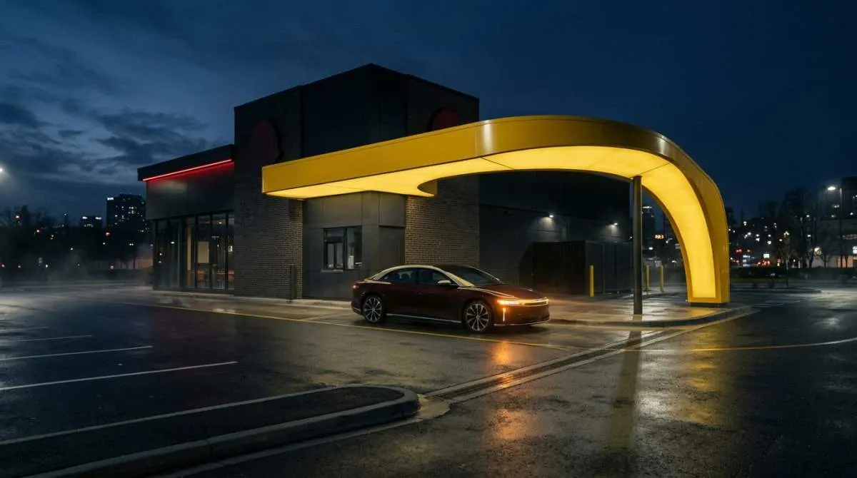
Picture a bright yellow cardboard carton, balanced on a knee in a moving car. The smell of hot fries and salt fills the space. That specific,sunny yellow wasn't just a color-it was a whole vibe, a sensory anchor to countless childhood meals.
For decades, it was simply the color of Wendy's. Then, it vanished, replaced by a sleeker, more corporate palette of red and white.
Now, it's back. Starting September 28, 2026, that iconic hue is returning to Wendy's fry cartons, cups, nugget boxes, and Frosty cups. This isn't a random design regression. It's a meticulously planned revival, a case study in how brands are mining our collective memory for emotional gold.
From Founding Hue to Forgotten Relic
The story begins in 1969, when Dave Thomas named his new burger joint after his daughter and wrapped its offerings in a cheerful, confident yellow. This color defined the brand's visual identity for its first few decades. It was on everything, a bold statement in the fast-food landscape.
But trends shift, and brands evolve. Over time, that sunny yellow was phased out. The world moved toward the red-and-white schemes that came to dominate Wendy's modern image.
The yellow packaging became a relic, a detail filed away in the mental archives of anyone who grew up in the 80s or 90s. It joined a category of forgotten ephemera, not unlike certain vintage toys or board game history that only resurfaces in thrift stores or online auctions.
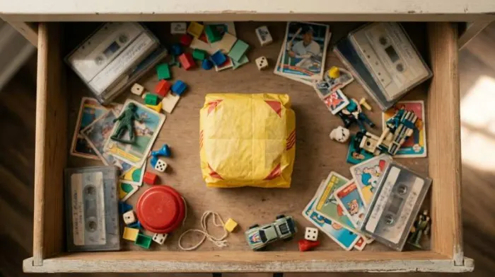
Yet, unlike some childhood treasures, this one refused to stay buried. It began with whispers online, then grew into a chorus.
The Engine of Comeback: Fan-Powered Nostalgia
The driving force behind the yellow's return wasn't a corporate brainstorm. It was a sustained, years-long campaign of fan requests. On social media platforms and in emails to the company, people kept asking, remembering, and wishing for that distinctive yellow bag.
Wendy's Chief Marketing Officer, Tariq Hassan, later confirmed this was one of the most requested comebacks the brand had ever seen. This fan-driven demand highlights a crucial shift in modern branding. Consumers aren't passive recipients of marketing.
They are active archivists, curators of their own pasts, and they're not shy about telling companies what parts of that past they want reinstated. This trend taps directly into a powerful wave of 80s and 90s nostalgia.
For millennials, now wielding significant purchasing power, these decades represent a formative period. The revival speaks to a desire for comfort and recognizable touchstones. Online, the excitement for the yellow packaging sparked wider conversations, with fans calling for the return of other nostalgic elements like salad bars and older-style fries.
It reveals that our connection to these brands is often less about the food itself and more about the total experience-the packaging, the ambiance, the feeling of a specific time. This emotional pull is what transforms a simple carton into a collectible.
White House Whopper
- You might have heard a wild story that the White House or a former president strong-armed Wendy's into bringing back the yellow bags.
- The real scoop is simpler: Wendy's own brass says it was all those years of fan emails and tweets that did the trick, calling it a top fan request.
More Than a Color: The Strategy of "Newstalgia"
So why is Wendy's changing its bags? The answer is layered. First, it's a direct and powerful response to consumer demand, a way to say, "We hear you."
Second, it's a masterclass in emotional marketing. By reintroducing a potent visual trigger, Wendy's isn't just selling a hamburger. It's selling a feeling-a hit of familiarity and comfort.
Third, and critically, it's a limited-time play. The rollout, stretching from late 2026 into early 2027, creates urgency and buzz. It turns a meal into a momentary event, a chance to participate in a shared cultural callback.
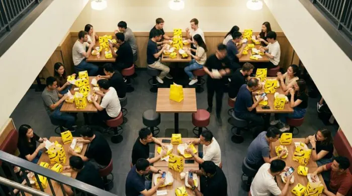
This strategy leverages what some call "newstalgia"-remixing childhood recognition for present-day engagement. It's a calculated risk that pays off by forging a deeper, more personal connection in an incredibly crowded market.
When every brand shouts about quality and value, whispering about shared memory can be a far more effective megaphone.
- The revival directly targets millennials, a demographic with potent nostalgia for their youth and the spending power to act on it.
- It transforms ordinary packaging into a conversation piece and social media moment, generating free publicity.
- It allows the brand to celebrate its own heritage, linking back to founder Dave Thomas's original vision without seeming dated.
The phenomenon shows that vintage appeal isn't confined to dusty collectibles. It has real-time marketing power. The intense reaction proves consumers crave tangible links to the past, whether it's a bag color or a discontinued menu item.
This hunger suggests a ripe opportunity for limited-edition retro merchandise, much like the frenzy that can surround vintage dolls or action figures from the same era. The emotional driver is identical.
Your French Fries, Now Served With a Side of Memory
Where does this leave us? For the next several months, the tangible proof of this strategy will be in your hands. That bright yellow carton is more than a container.
It's a bridge. It connects the Wendy's of Dave Thomas's 1969 founding to the digital, demand-driven marketplace of 2026.
It proves that in our fast-forward culture, there's immense value in looking back. Not to live there, but to borrow a bit of its warmth.
The next time you see that sunshine-yellow cup, you're not just holding a drink. You're holding a piece of a calculated, heartfelt, and wildly smart brand revival. And it all started because people never forgot the color of their childhood fries.
What year did Wendy's original yellow packaging debut
The original yellow packaging debuted in 1969, the same year Dave Thomas opened the first Wendy's in Columbus, Ohio. That first location was a simple walk-up stand with no indoor seating, and the sunny yellow was chosen to stand out against the red-and-white of competitors like McDonald's. It quickly became a visual shorthand for the brand's friendly, family-focused vibe.